Tips for Navigating the CloudResearch Dashboard

In January 2021, we updated the CloudResearch Dashboard. In this blog, we highlight the major changes and some useful navigation tips that can make accomplishing tasks from the Dashboard easy and efficient.
Look and Feel
The biggest change we made to the Dashboard was an update to the look and feel. Our update employed a different color scheme and changed the layout of studies on the page.
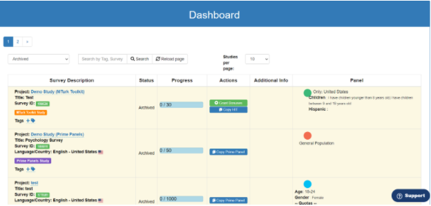
Old Dashboard
New Dashboard
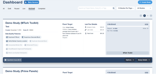
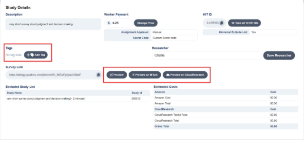
The new Dashboard also organizes several pieces of information more efficiently, allowing you to see the important details of your study with just a glance. In the image below, it’s easy to see details like a project’s title, demographic targeting criteria, costs, and the number of people who have completed the study straight from the Dashboard.
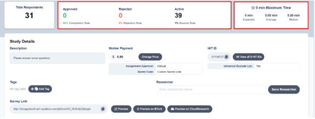
Like the old Dashboard, when you click on “Study Details” you will see an expanded view with several additional study details.
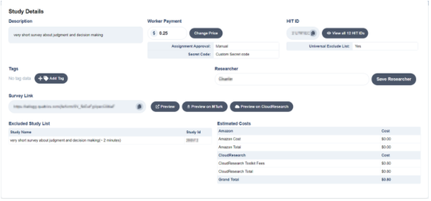
From the expanded view, you can do things like add tags that make it easy to search through studies. Or, you can preview what your study looks like from your survey platform (Preview), on Mechanical Turk (Preview on MTurk) or see what the HIT looks like to participants once they accept it on MTurk and reach the CloudResearch HIT page (Preview on CloudResearch).
Navigating the Dashboard
The old CloudResearch Dashboard had features that made navigating and managing studies easy. We’ve maintained many of these features and added some new ones.
Organizing Studies
You can organize studies in several different ways to make navigation simpler. The first option is to display studies by status. You can choose to view all studies you’ve created, only paused studies, live studies, archived studies, or studies that have completed but not been archived. Each of these selections will limit the number of studies that appear on your Dashboard, which makes finding specific studies easier.

Next, you can choose how many studies appear on the Dashboard at one time.

Finally, you can also sort studies by whether they were created for the Mechanical Turk Toolkit or our Prime Panels platform.

Telling Project Status
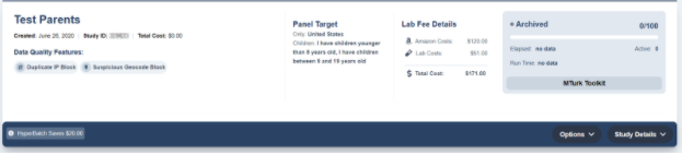
One subtle Dashboard detail is the background color of each study: they are color coded to match a study-specific status. Studies that are waiting to launch have a red highlight, live studies have a green highlight, completed studies have a blue highlight, and archived studies are highlighted with gray. A study’s background can help you identify which project you are looking for in a list, especially when you have copied multiple studies in the past.


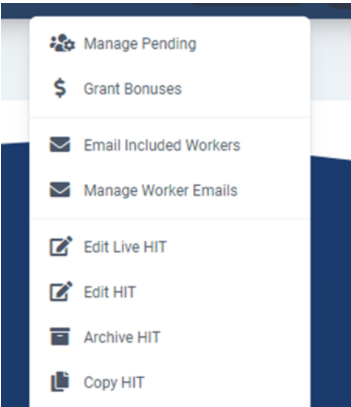
Finally, when your study is live, you can execute a number of actions directly from the Dashboard. From the Options tab, you can manage pending submissions, grant bonuses, edit your study, or email participants to let them know the study is available.

Monitor Your Study by Checking Its Stats
Finally, when you run a study with our MTurk Toolkit, we provide several stats you can use to make important study-related decisions. For example, when you click on Study Details from the Dashboard, you will see a dropdown box that displays stats like the average, median, and expected time to complete the study. With these numbers you can see whether it is taking participants longer to complete the study than you estimated and adjust the pay accordingly.
Another important piece of information in the dropdown box is the number of participants who have started your HIT, been approved or rejected, and the study’s bounce rate. This information can help you determine whether something about your study is unattractive to participants (using the bounce rate) or whether an aspect of your study setup is making it hard for people to complete the study (using the dropout and completion rates; see our blog on dropout and completion rates for more details).